Mon 6th October 2008
|
The BBC ran an interesting article today on the different fonts in use on film posters, something I've never really considered but something I'm finding quite interesting now I've seen some examples. This blog post is a single page version of the BBC's, please see the end of this blog post for a link to the orginal BBC article.
We see film posters every day. But have you ever stopped to think about the lettering they use? Sebastian Lester has. As a typeface designer for Monotype Imaging, he's a literal font of knowledge.

Many posters, like this one for the fourth Indiana Jones, use custom lettering. As Lester explains, though, others employ fonts in common everyday usage.

2001: A Space Odyssey (Futura)
According to Sebastian Lester, the font used on the poster for Stanley Kubrick's 1968 sci-fi epic has "a truly space-age pedigree". "Futura was the official font of the Apollo moon landing program," he explains. "Because it's based on geometric features - the square, the circle and the triangle - it's got an inherent simplicity and timelessness."
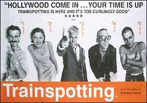
Trainspotting (Helvetica)
Sebastian Lester says the Swiss font Helvetica was chosen for the Trainspotting poster because of its similarity to that used on a train timetable. "It's also used a lot on chemical packaging, which was suitable given the drug references in the film," he adds. "Helvetica is associated with modernism and minimalism. It's clean, simple and ordered."

The Matrix (OCR-A)
OCR-A, the font Keanu Reeves and Laurence Fishburne's names are written in on the Matrix poster, was a typeface designed to be read by computers in the 1960s. "It's a monospaced font - all the characters are the same width," says typeface expert Sebastian Lester. "OCR, which stands for Optical Character Recognition, has a very digital aesthetic."

The Dark Knight (Franklin Gothic)
"Franklin Gothic has a stark and heavy feel to it," says Sebastian Lester. "The Dark Knight's approach was to firmly establish a believable, real-world version of Gotham and the choice of typeface reflects this. "Gothic is an industry term. But I wonder if someone at the studio connected Gothic with Gotham - it could have easily been that lateral."

Sex and the City (Trajan)
"This typeface is the most used and abused typeface in Hollywood," says Sebastian Lester. "Based on the stone carved letters found on the base of the Trajan Column in Rome, it's as beautiful as it is ubiquitous. "Graphic designers originally used it to elicit a sense of epic history, but now it's used on everything from Titanic to The Mummy."

Quantum of Solace (Neutraface)
"The typeface used in the new James Bond poster has its roots in the early 20th Century and the architectural lettering styles of that period," says Sebastian Lester. "Geometric fonts like this have a sense of efficiency and modernity about them which is universally appealing. "It takes its name from the Austrian architect, Richard Neutra."
(Source: BBC News) |
| |
| |
Mon 21st April 2008
|
Olle over at Eatlon.com, as well as redesigning his site for a fourth time, has released his latest template entitled 'Business'.
As the title suggests, the business template is designed for a professional corporate look. The XHTML and CSS are fully W3C validated also.
For a demo click here, or to download click here.

|
| |
| |
Wed 5th March 2008
|
Olle Axelsson, genius designer over at eatlon.com has released two sparkly new templates today.
The two templates are called 'Towers' and 'Nebula' and are essentially the same template but with different images and a different colour scheme.
If you are interested in downloading any of these templates, head over to Olle's templates page. Nice work Olle.

|
| |
| |
Sun 3rd February 2008
|
Talented web designer Olle Axelsson has just released his latest design to the public.
The new template is called 'V2' and was actually used over at eatlon.com when the site first launched but after a recent redesign, became redundant and is now available to download for free.
You can view the demo of 'V2' by clicking here or you can download it by clicking here.
Remember to check out Olle's other templates which are all available for free and are made to an exceptionally high standard.
Excellent work Olle - keep it up!

|
| |
| |


